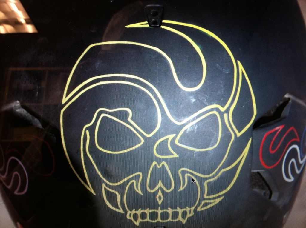
I heard this design talked about on the Playa by certain PL people.AD72 - 17-4-2011 at 08:18 AM
Please no skulls. There are enough skulls on motorcycle stuff that looks tacky, not tough and menacing and it ends up just looking tacky on a kite.
One of the reasons why I like the Phantom design because it is not a skull.AD72 - 17-4-2011 at 08:24 AM
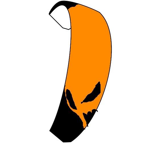
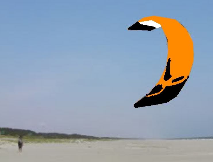
Nice phtoshop work though.arkay - 17-4-2011 at 09:19 AM
Really nice design and incorporation of the logo, but for me it's a little too much for a kite. Would look great as a small logo, but imagine it 10
ft tall. Just has too much of an an evil twinge to it. I think the trick for a kite is to find the balance of cool, chic, with a splash of naughty.
The old design was pretty much loved by everyone, I imagine this one would be highly polarized. I hope PL is spending as much time on the graphic
design as on the foil design...erratic winds - 17-4-2011 at 09:36 AM
Waay too close to the outlaw graphics for my taste.
I also am of the # that loves the phantom graphics because it's not a clearly defined skull. It's a bit vague, people see all sorts of things in it.
I'd imagine that's one of the reasons it's so loved.AD72 - 17-4-2011 at 10:46 AM
Peter Lynn Kites just changed his Facebook profile pic to your design.AD72 - 17-4-2011 at 10:48 AM
Quote:
Originally posted by erratic winds
I also am of the # that loves the phantom graphics because it's not a clearly defined skull. It's a bit vague, people see all sorts of things in it.
I'd imagine that's one of the reasons it's so loved.
You put it better than me. Agreed.pokitetrash - 17-4-2011 at 12:08 PM
Yea, I like the old Phantom design. How cool would it to be to use the original design but with red eyes? Sort of Amityville Horror-ish...
No skulls on my kite for me please. I have plenty of skulls and flames on my HD and I admit I'm a poser in that regard. I bought it that way. :evil:WIllardTheGrey - 17-4-2011 at 01:38 PM
Quote:
Originally posted by AD72
Peter Lynn Kites just changed his Facebook profile pic to your design.
No that's were I got it from. I did not make it.BeamerBob - 17-4-2011 at 08:00 PM
Simpler is better. The understatement on the P 1 graphic is just perfect. You have to let your eyes adjust to see the image. It's ok to turn it so
the kite is symmetrical, but don't doll it up too much.Kamikuza - 17-4-2011 at 11:46 PM
A quick mash-up ... put the phantom face on both ends so when the kite is doing its job (hauling ass) it can be seen by those on the ground - one face
is down, the other up ... one face on either tip = Phantom 2 :D
WIllardTheGrey - 18-4-2011 at 12:28 AM
I bow to your creative brilliance. That's a fantastic idea.furbowski - 18-4-2011 at 01:21 AM
that 2-ended phantom idea kicks butt, kami... Nice one! Agree with the no skulls on my kite (flowing colors best for me) although I actually kinda
like that mash-up of the logo and a skull.....Feyd - 18-4-2011 at 04:33 AM
I agree, no skulls, snakes or dragons.
The quick photoshop image of the kite with the skull was only a loose example of a more "sinister" image than what is currently being produced on
other PL models. In the email that the image was attached to it was specified that a skull would not be the image of choice.
It's just stupid easy to make a skull.
I like the use of negative space on both images. I like the old P1 graphic but this is a different kite and I think a different graphic would be on
order. I like the Black/whatever color, pattern. I also like the fact that the graphic on the P1 doesn't date the kite.
That graphic looks as cool now as it did when it came out. All the graphics I see produced on kites and stuff today all seem to be falling into the
same lines. That sorta "grafitti" style, as cool as it is, is being played to death. In a few years it will look wicked dated.
I really like Kami's idea of the 2 faced graphic. Blatantly obvious and I can't beleive I didn't see it before. Might be on to something there.
The thing I do like about the Skull graphic is the way it would look on the ground on it's trailing edge from the side.
Personally I still like basic black. ;-)indigo_wolf - 18-4-2011 at 05:08 AM
Quote:
Originally posted by Feyd
I agree, no skulls, snakes or dragons.
No skulls... ok.
No snakes... fine.
No dragons? Hey now... I actually wouldn't mind something with dragons.
ATB,
SamSeanny - 18-4-2011 at 07:09 AM
Quote:
Originally posted by Feyd
I agree, no skulls, snakes or dragons.
I suppose that also includes chrome, flaming playing cards, dice, Smurfs, medieval weaponry, and grim reapers? :Dmacboy - 18-4-2011 at 01:34 PM
Nice Kami! I'd buy that.
.....of course I can't help but wonder if a Smurf kite would catch on and sell like crazy.......Seanny - 18-4-2011 at 02:21 PM
It might also be cool if where the two colors congeal (black + x ), the resulting image could be seen as two different pictures depending on what
color you look at. Like the optical illusion with the two men and the lamp.
We should also add no mud flap girls, no Harley shields, no rebel flags.
Sorry Sam, I'm just not feeling the dragons. Seanny - 18-4-2011 at 09:25 PM
LOL Rebel flags! I forgot about that one :wee:
I think there should be an ENORMOUS POT LEAF on the kite :bigok:Drewculous - 20-4-2011 at 11:50 AM
Quote:
Originally posted by indigo_wolf
No dragons? Hey now... I actually wouldn't mind something with dragons.
ATB,
Sam
you like dragons huh?
(i'll admit its a stretch lol)arkay - 20-4-2011 at 03:06 PM
Musical anyone?
Feyd - 20-4-2011 at 04:16 PM
I'm leaning towards "Hello Kitty".
Saw a dirt jumper (bike) that was liscensed with Sanrio and it was awesome. Pricey but pretty damn funny.
Imagine rippin across the ice, water, desert or hucking your meat under a huge "Hello Kitty" head.
Yup, bad ass.indigo_wolf - 20-4-2011 at 05:19 PM
Quote:
Originally posted by Drewculous
you like dragons huh?
(i'll admit its a stretch lol)
Looks more like fish with oversized fins.
I have a gaggle(*) of dual-line foils with this pattern on them:
The nice thing about dragons (at least the Oriental version) is that their sinuous nature tends to negate problems with orientation.
(*) A gaggle because they were deeply discounted and when I feel the need to humiliate myself, I'll try to fly two of
them simultaneously. :Ange09:
ATB,
Sammougl - 20-4-2011 at 06:14 PM
Personally I'd like to see a double ziggy on the P2, maybe facing each other...Drewculous - 20-4-2011 at 06:37 PM
lol those dragons are sweet, much better than the 06 waroo (google depower downfall) lmao pbc - 20-4-2011 at 07:31 PM
Quote:
Originally posted by Feyd
...
Imagine rippin across the ice, water, desert or hucking your meat under a huge "Hello Kitty" head.
Yup, bad ass.
Sign me up!BeamerBob - 20-4-2011 at 07:43 PM
I know I saw a pic of Ripsession sporting a Dora the Explorer sticker on his Apexx number plates. Hard won sponsorship I'm sure. :bigok:pbc - 21-4-2011 at 08:16 PM
Quote:
Originally posted by Feyd
I'm leaning towards "Hello Kitty".
How about Phantom Kitty?
arkay - 21-4-2011 at 09:13 PM
omfg, wtf bbq. I want it. no. no. wait. I need it.AD72 - 21-4-2011 at 09:56 PM
LOL phantom kitty. That is friggin great!pbc - 22-4-2011 at 03:38 AM
I think this one might be more what I'm looking for.
Drewculous - 22-4-2011 at 06:25 AM
dude... no... just, no!
No kitties on my kites.... i like cats, but no......
now a domo..... maybe
indigo_wolf - 22-4-2011 at 07:53 AM
The domo is strangely .... Adipose-like
ATB,
Samerratic winds - 22-4-2011 at 08:33 AM
while I love domo-kun,he's just about the cutest thing I've seen, it'd essentially be the same as putting the NBC pea#@%$#! on a kite... (Domo is the
mascot of NHK, a Japanese broadcaster)flyjump - 22-4-2011 at 09:30 AM
ADIPOSE! i'm glad Dr. Who is starting again this weekendindigo_wolf - 22-4-2011 at 09:58 AM
Quote:
Originally posted by Drewculous
dude... no... just, no!
No kitties on my kites.... i like cats, but no......
Your adamant position against cats adorning (nay, gracing) kite canopies is... most... disturbing.
Mr. Lynn needs to show some national pride and incorporate some of the local fauna in his kites.
(*)
(*) The utter fail at 0:37 of the second Telecom NZ video can only be attributed to inexperience in front of the
camera.


 ....sigh